
How to Save Tokens in Claude Design Without Killing Creative Quality
A practical playbook for reducing Claude Design usage, avoiding rework, and getting better output from every prompt without sacrificing creative quality.
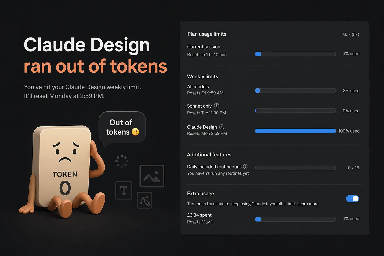
Claude Design is one of the fastest ways to go from rough idea to real artifact. That speed is exactly why people burn through usage too quickly.
Most teams do not run out of tokens because they are doing too much high-quality design work. They run out because they spend tokens on vague prompts, repeated context, and full rewrites when targeted edits would have worked.
If you want better output and lower usage, the playbook is simple: reduce ambiguity before generation starts. I write practical prompt and workflow guides at AI UX Playground, and this post breaks down the most useful patterns I have seen for Claude Design workflows.
Why Claude Design feels expensive fast
Claude Design is built for visual work: prototypes, slides, one-pagers, mockups, collateral, and design handoff. It is not just text completion with a pretty wrapper.
When you ask for broad changes like "make it better," Claude has to reinterpret intent, visual direction, hierarchy, and tone across the whole artifact. That is where usage gets wasted.
The real cost driver is not always prompt length. It is rework caused by unclear direction. The goal is not short prompts only. The goal is clear prompts once.
1. Start with a tight brief, not a vague ask
Bad:
Better:
The second version costs more input tokens, but usually saves total usage because you avoid three rounds of corrections. For reusable templates, start at AI UX Playground Prompts.
2. Ask for visual directions before full generation
One of the highest-ROI habits is splitting direction from execution.
This prevents expensive full design regenerations when the core aesthetic is wrong. Cheap decision first, expensive build second.
3. Use scoped feedback with "change" and "keep"
Most revision loops fail because feedback only says what to change, not what to preserve.
Instead of "redo this section," use:
This cuts accidental drift and reduces full-canvas rewrites. For reusable scaffolds, see the prompt engineering guide and adapt it into your review ritual.
4. Batch revisions into one pass
Five tiny follow-up messages cost more than one clean revision pass and usually produce noisier results.
You get fewer context reloads and better consistency between edits.
5. Stop regenerating the whole artifact
Full rewrites are often the biggest token leak. If the issue is copy, revise copy only. If the issue is hierarchy, revise layout only. If the issue is style, revise style while locking structure.
This simple line can cut revision usage dramatically.
6. Keep input assets tight
Large screenshots, long decks, and bloated references create expensive context. Before uploading anything, ask:
- Can this be cropped?
- Can this be reduced to the relevant section?
- Can I paste key text instead of full document upload?
A tight visual crop with clear instruction usually beats a giant file dump.
7. Plan in chat, build in design
Use standard Claude chat for low-cost planning, then move to Claude Design for artifact creation.
Suggested flow:
- Define audience, goals, and message in chat
- Generate a concise brief
- Move that brief into Claude Design
- Run structured revision passes
This keeps visual generation focused and minimizes exploratory churn.
8. Reset when the concept changes
If you pivot from "playful consumer landing page" to "enterprise security dashboard," that is a new problem, not a revision. Start a fresh thread with a new brief instead of forcing Claude to reconcile contradictory history. Fresh context is often cheaper than repairing a misaligned conversation.
9. Use category-specific prompt libraries
Do not reinvent prompting language every time. Reusable prompts improve quality and reduce wasted turns. Browse by category on the site:
Category-specific prompts give teams a shared vocabulary for critique and iteration.
10. Treat tokens as attention, not just cost
Token optimization is not only about budget. It is attention optimization. Every vague prompt, unnecessary asset, and broad rewrite asks Claude to spend attention on the wrong thing. Better direction means tokens go to actual design quality: hierarchy, clarity, tone, and user comprehension.
The teams that get the best results are not the teams with the shortest prompts. They are the teams with the clearest intent.
Final workflow you can adopt today
Use this default process:
- Brief first, generate second
- Directions before full artifacts
- Scoped edits with clear "keep" constraints
- Batch revision notes
- Avoid full rewrites
- Reset on concept shifts
- Reuse prompt templates from your library
To operationalize this with your existing prompt system, start at AI UX Playground Prompts and make the prompt engineering guide your team default. That one change will save tokens and improve output quality at the same time.
Also published on Substack
Read or discuss on Substack →Weekly insights in your inbox
A weekly newsletter for designers, PMs, and builders shipping AI products. Practical AI UX: patterns, real products, no hype.